
We tested Pepsi’s new logo with Gen Z consumers in four markets. They did not like it.
Recently Pepsi launched a new logo to pretty good reviews.
Which is unusual.
It’s hard to launch a new logo or rebrand for a favourite or high profile product or service without attracting derision from the rest of the marketing industry, the mainstream media and occasionally, if they notice, customers and the public.
It’s basically a free hit for all of them.
We in the marketing community know a new logo and ‘livery’ can be important to refresh a brand, but in the eyes of consumers, it performs no tangible function and is occasionally accompanied by the worst thing a brand can be associated with – the language of design thinking.
“X refreshed their brand the other day and I approved of their custom typeface and palette of crisp new colours denoting freshness and elegance” said no real person ever.
If consumers ever hear this stuff they either feel stupid or, worse, that they are being scammed.
Mainstream journalists who in many ways are the opposite of marketeers and are trained in reductive thinking can’t help but see this as all bullshit from overpaid dilettantes.
But if the brand is big enough it’s an opportunity for some outraged reader engagement especially if someone confesses to how much the rebrand cost and a random customer vox pop shows that at least one person hates it.
The list of publicly reviled logo refreshes is long, and sometimes the reaction is so strong that the new version is abandoned as GAP was forced to do in 2010. The Pepsi PR team will be relieved to have avoided this fate so far.
Negative consumer sentiment to new logos and rebrands is common because people often don’t react well to changes to familiar and loved products. If you genuinely enjoy a product or a service the last thing you want is a marketing person ‘improving’ it for you.
Which is where Pepsi finds itself, because at least one group of consumers do not agree with the great and good in the marketing community and prefer the old logo to the new one.
We know this, because Stickybeak tested it!
We asked 400 18-24 year old consumers in Australia, New Zealand, Philippines and Singapore which of the two logos they preferred. The ‘hard-to-research’ Gen Z and an important segment for youth obsessed Pepsi which has claimed to be the ‘taste of a new generation’ and ‘generation next’ and spends a lot of resource embedding the brand in global youth culture.
Here’s exactly how the question looked to the respondent:

As Stickybeak recruits real people via social media rather than using professional responders on traditional panels, we only have a very limited amount of their time before they get back to TikTok or Instagram from where we interrupted them.
This is a feature of Stickybeak not a bug by the way. We think this is much more like the normal retail experience.
‘I have a bunch of things going on, ‘oh what brand do I preferrrrrrrr . . . . that one’.
For fast moving consumer goods brands competing on the shelf in the cooler or at the check out, this is exactly how it is. A fast decision made on the go with other things happening around you and more important things to get to.
So the Stickybeak interface is incredibly fast and familiar and in this case people simply swipe on the desired option.
And when they did:
82% of those Gen Z consumers in four different countries preferred the old logo and 18% preferred the new logo.
That’s over four to one preferring the old logo and defying those marketing thought leaders that have hated that logo since the day it was launched.
Most marketing commentators are of course middle aged and based in a developed market and so it is perhaps not surprising they think differently to gen Z consumers and people outside of the US and UK.
Here are the results of the Stickybeak test:
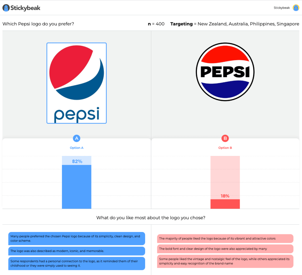
The verbatim comments you can see are an automated Chat GPT summary of the hundreds of text responses we got to the follow up question ‘why’ did you prefer the option you did. This is also available in a word cloud or in full via CSV since you asked!
To be clear, Stickybeak is NOT suggesting that the new Pepsi logo is a dud. Or even that the old one is great. Just that one is familiar and one is not.
And so there will be a period of time before consumers get used to the new one and during that time it is less effective than the old one.
So expect an above-the-line, in-store and promotional blitz to accompany the rollout of the new cans next year, because Pepsi almost certainly anticipated this and they will want people to become familiar with the new one fast.
Perhaps once they’ve done that, we’ll re-test the two logos and see how it all settles down?
In the meantime Stickybeak is your best and fastest global platform for testing logos, packaging, messages, creative, influencers and just about any content anywhere to help you make better marketing decisions faster and you don’t have to be as big as Pepsi though we do already work for some of the world’s biggest brands too.
We turn this sort of test around in about 48 hours and can reach any consumer segment in any market worldwide. Test us.
For further information contact Anna@stickybeak.co for a demo or further information and join companies like TetraPak, SCJ, Dole, WHO, Tasti-Foods, Uber and Vodafone who all test logos, packaging, creative and messaging with Stickybeak.
